.svg)

End-to-End UX Ownership | Human-Centred Research | UX Strategy & Experimentation | Information Architecture Redesign | Design System Creation & Management | Data-Driven Design | MVP & Ideal-State Design | Roadmapping & Prioritisation
Context
SiSU Health is a healthtech startup that operates self-service health stations across Australia and the UK. These kiosks provide people with free access to key health metrics like weight, BMI, blood pressure, and body fat.
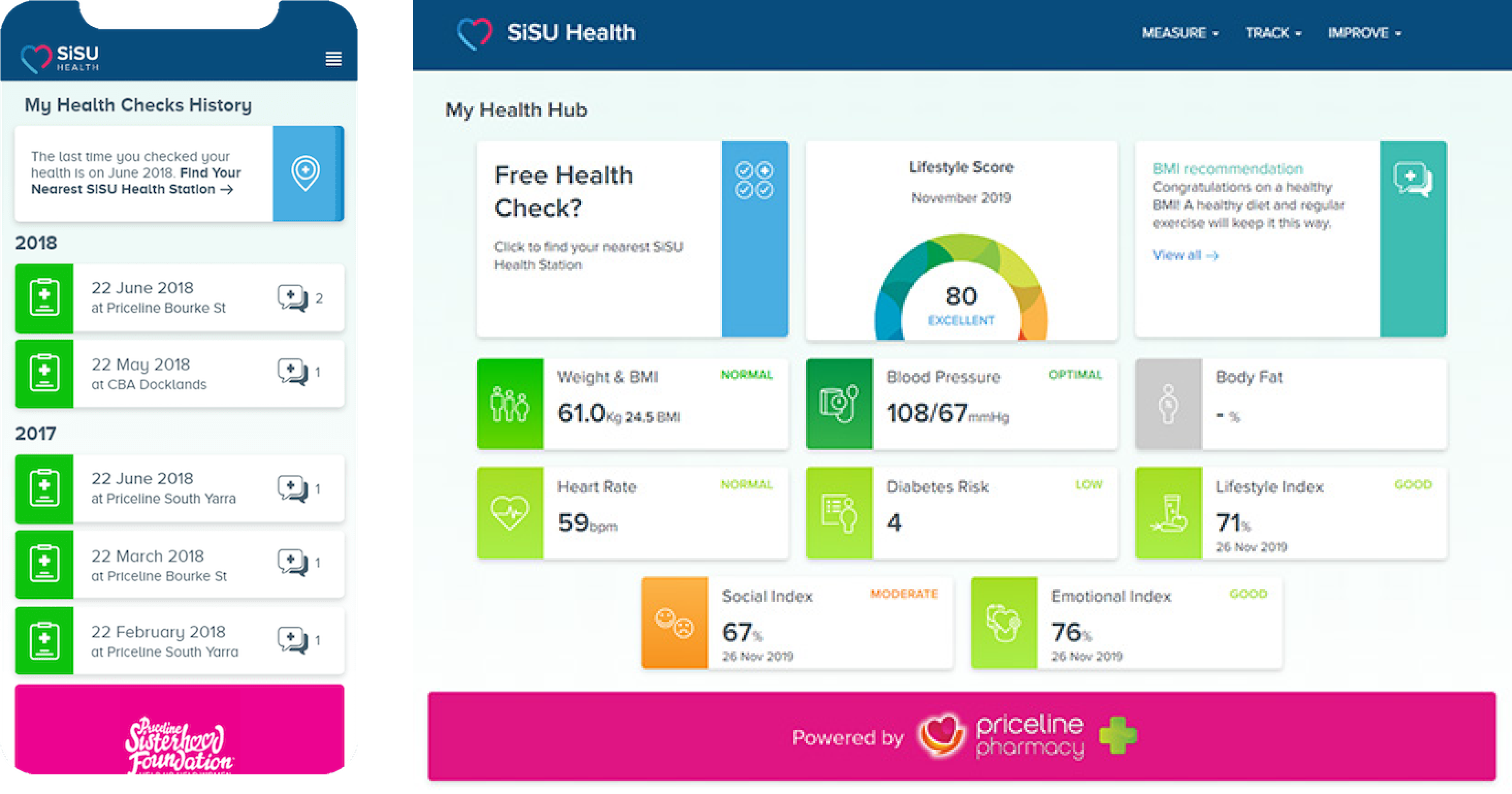
While the stations delivered valuable information instantly, users were also encouraged to visit an online health dashboard to review trends, get health recommendations, and explore additional services like online prescriptions and sleep support.
The data told a different story: most users simply weren’t coming back.
.png)
Challenge
SiSU’s digital product wasn’t meeting user needs—or business needs. As physical interactions dropped post-COVID, the business needed the digital portal to carry more weight.
Key challenges included:
- Massive drop-off: Over 85% of users never visited the health dashboard after using the station.
- Unclear value proposition: The online portal wasn’t delivering enough insight or actionable recommendations.
- Fragmented user experience: The portal felt disconnected from the clean, professional experience at the kiosk.
- New business models: With increasing digital dependency, the company wanted to promote new features like online prescriptions and wellness services directly through the dashboard.
This wasn’t just a visual redesign—it was a product rethink. I was brought in to help reimagine the experience, from strategy to system-level design.
Solution
Our team worked on the end-to-end redesign of SiSU’s digital portal—transforming it from an underutilised companion site to a central digital health hub.
My work included:
- Business Canvas Workshops: Defined product-market fit for the digital dashboard and clarified monetisation pathways.
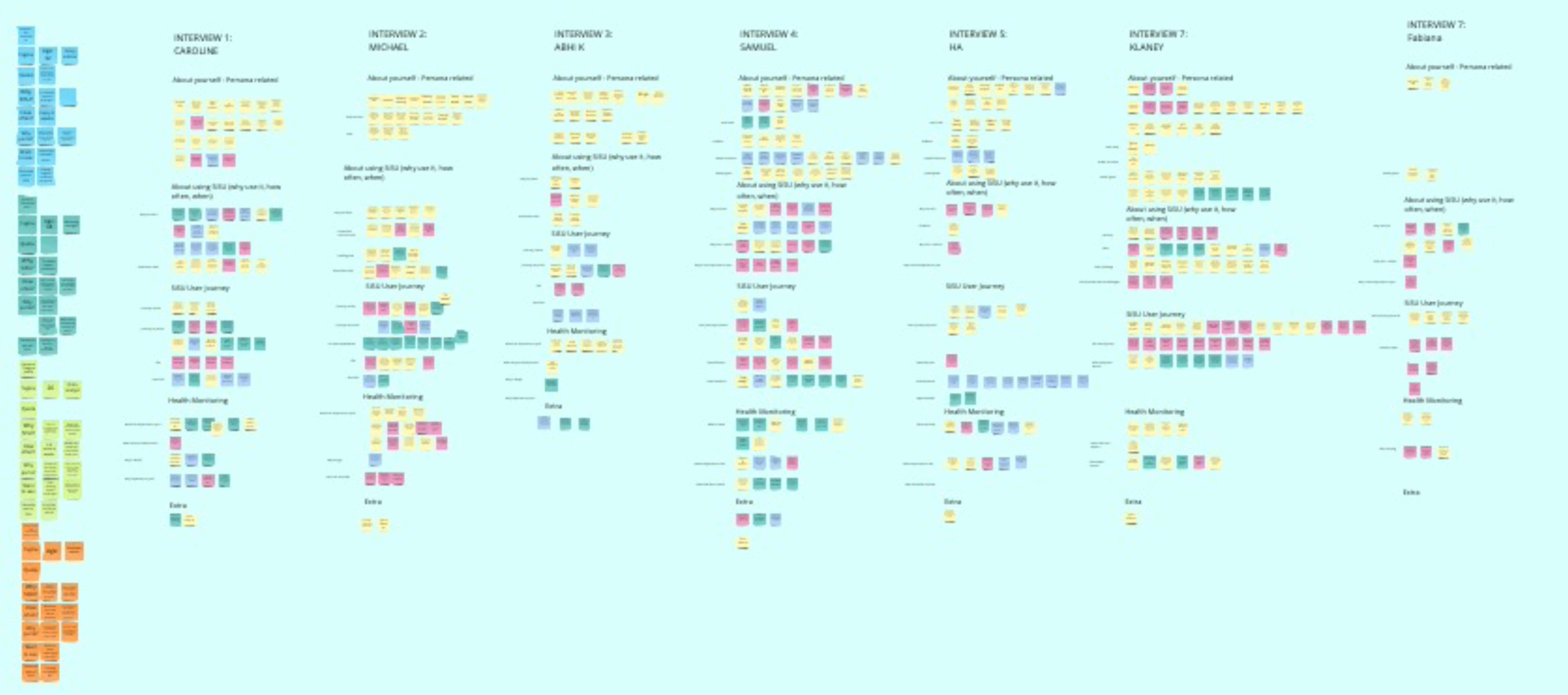
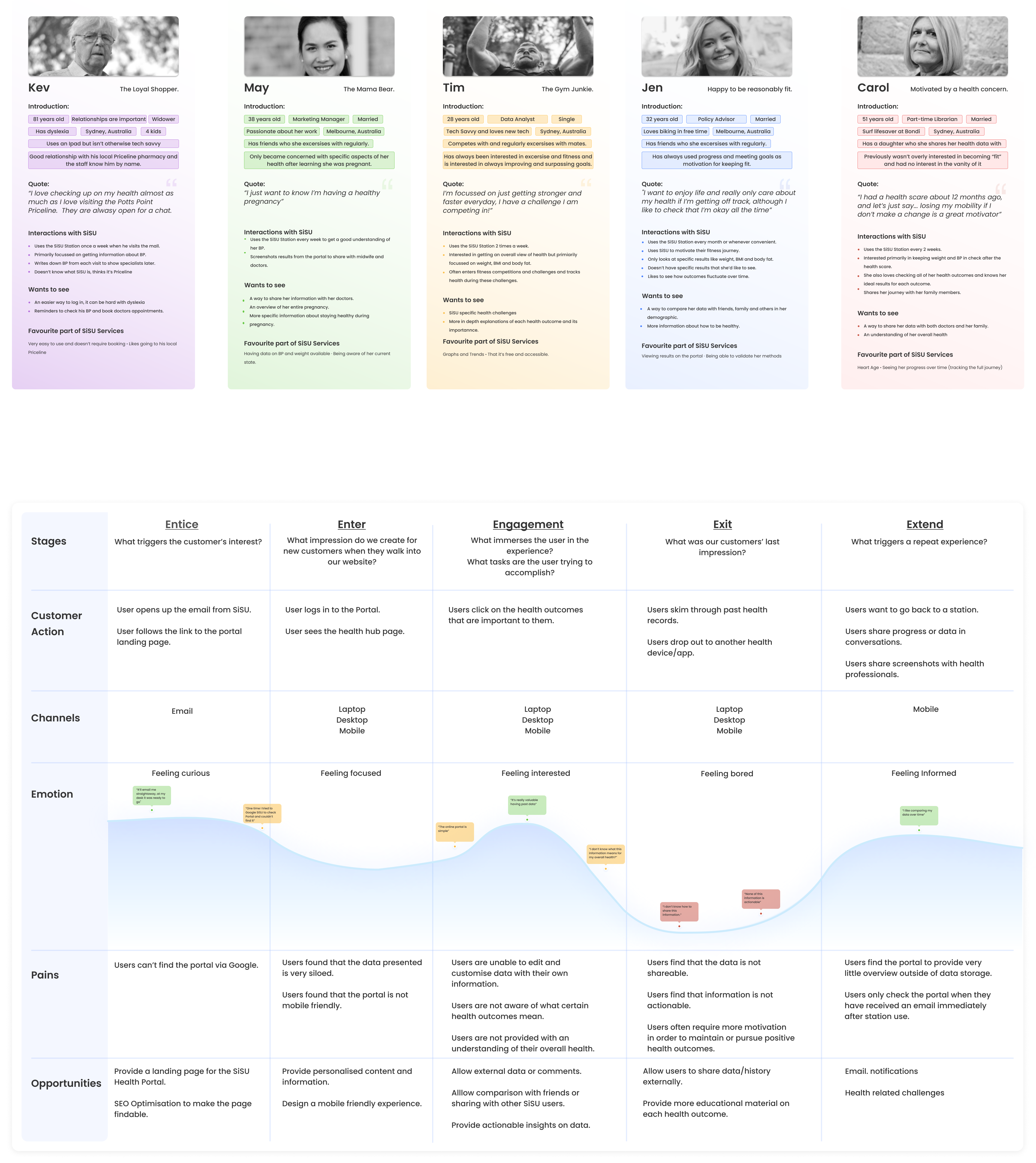
- User Research: Conducted interviews with users across age groups to identify why the portal wasn’t resonating and what health-related insights they actually wanted to see.
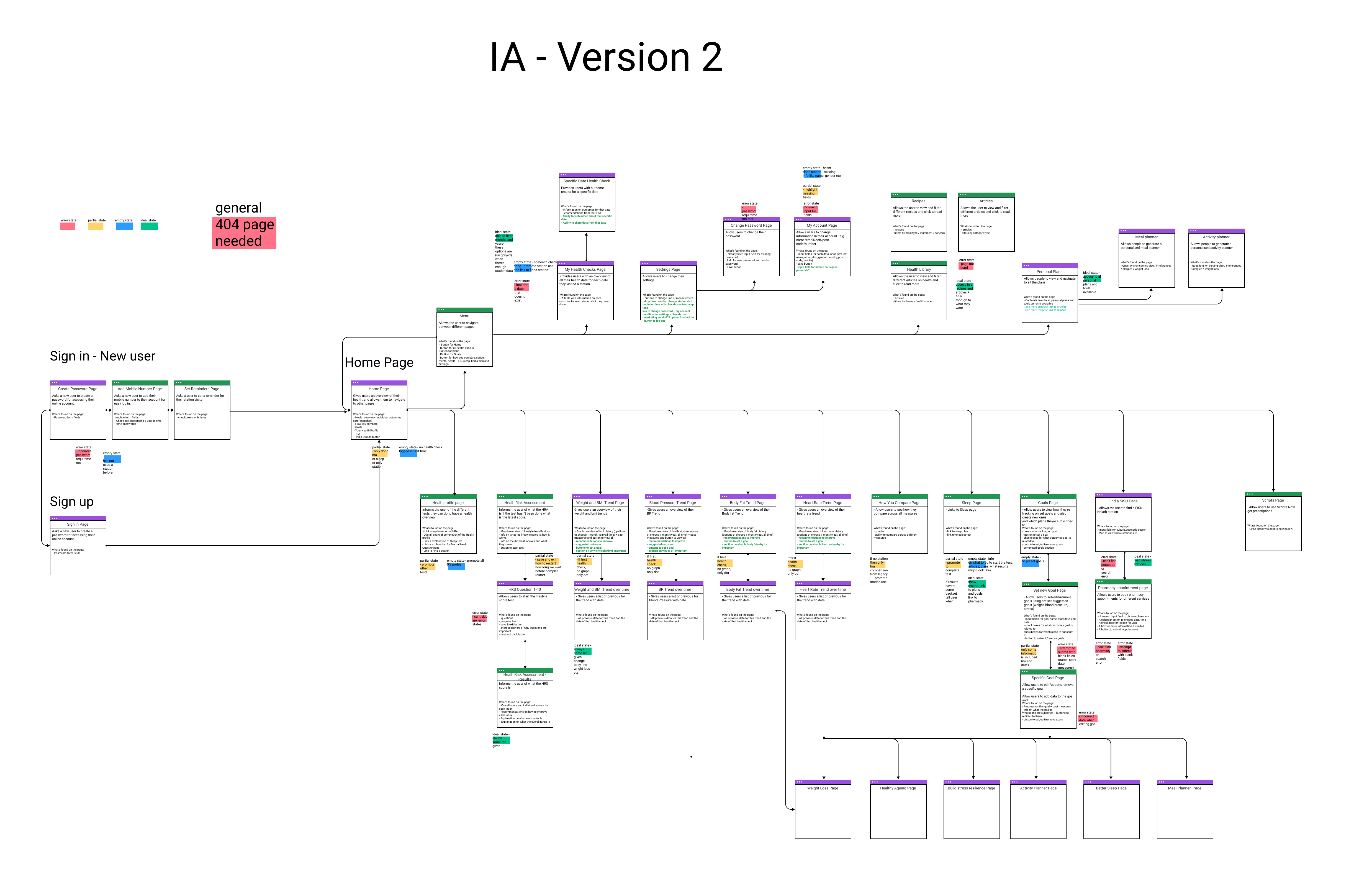
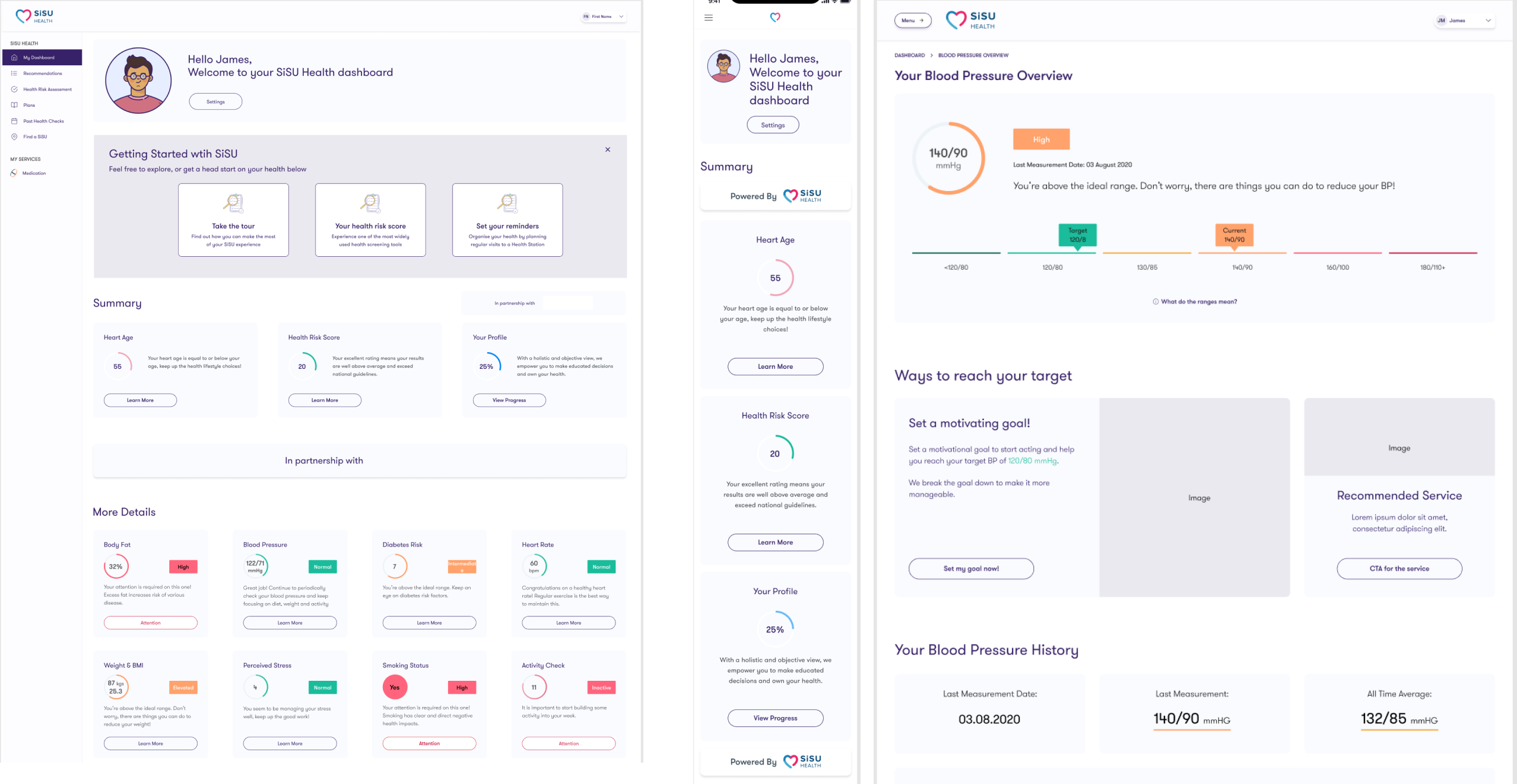
- Information Architecture: Completely restructured the dashboard to show trends, personal health benchmarks, and progress in a more intuitive way.
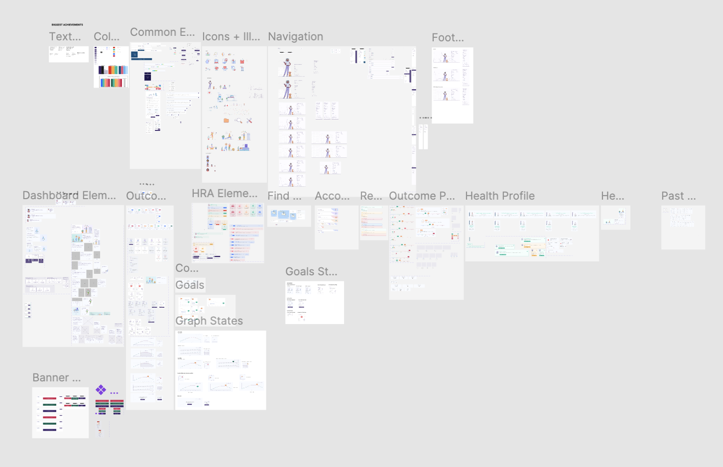
- Design System Leadership: Built a modular, scalable design system using atomic principles, including colour accessibility, tone consistency, and device-specific variants.
- Product Roadmapping: Worked cross-functionally with product and business teams to shape the MVP while designing a roadmap toward a richer, multi-feature platform.
Result
The redesigned portal provided a cohesive, data-rich, and user-friendly experience that aligned more closely with user needs and business goals.
- Increased retention and engagement post-launch (validated via user testing and a pilot release)
- Clear health insights, personalised callouts, and smart recommendations for services
- Seamless integration with new features like online prescriptions and wellness tracking
- Design system reused across other SiSU products for speed and consistency
The project proved that reimagining existing platforms with strategic UX investment can unlock new value—without needing to abandon the original product.
The Most Interesting Thing I Worked On
The most rewarding challenge was creating and owning a full design system that could scale across multiple teams, devices, and future use cases. I led accessibility audits, implemented atomic design principles, and ensured consistency across every component.
This wasn’t just about efficiency—it was about setting the visual and functional foundation for a growing digital ecosystem. From screen-size variants to accessible colour choices, to brand-aligned tone-of-voice choices - the system helped lift SiSU’s design maturity and product consistency significantly.